
AI-generated images often fail to look the way we expect.
Beginners commonly face issues such as:
- Subjects randomly centered with awkward empty space on all sides
- Important parts of the subject cropped off at the edges
- Busy scenes where the viewer does not know where to look first
- Characters blocking key background elements (or vice versa)
- Images that feel “messy” or “unbalanced” without knowing why
Most of these problems are caused not by the AI model itself, but by a missing understanding of a fundamental photography concept:
composition rules.
Understanding composition allows you to create clear, balanced, and story-driven prompts—regardless of the model you use.
1. Introduction to Composition Rules

In simple terms, composition is how you arrange visual elements inside the frame.
Composition rules are practical guidelines that help you decide:
- Where to place the subject
- How to balance the background and foreground
- Where you want the viewer’s eye to travel
- Which parts of the image are important—and which can stay simple
Some of the most useful composition ideas for AI prompt writers are:
-
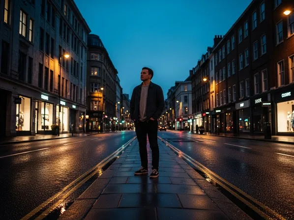
Rule of Thirds
Divide the frame into a 3x3 grid. Place key elements near the grid lines or intersections instead of dead center. This often feels more dynamic and natural. -
Leading Lines
Use lines (roads, railings, rivers, light beams) that visually “lead” the viewer’s eye toward the subject or into the scene. -
Framing
Use elements (doorways, windows, branches, architecture) to “frame” your subject, drawing attention to them. -
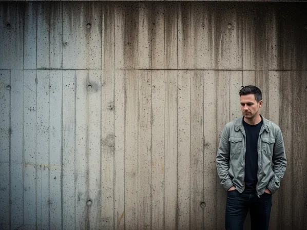
Symmetry & Centered Composition
Place the subject in the exact middle of the frame when you want a balanced, graphic, or formal feel. -
Negative Space
Intentionally leave empty or simple areas around your subject to create breathing room, focus, and mood.
For AI image generation, the model responds well to phrases like:
- “rule of thirds composition”, “subject off-center”, “centered symmetrical composition”
- “leading lines guiding toward the subject”, “framed by an archway”, “large negative space”
By controlling composition in your prompts, you control where the viewer looks and how the scene feels.
2. Applying Composition Rules in Prompt Writing
Let’s turn composition theory into practical, reusable prompt tools.
2-1. When to Use It
You should explicitly mention composition when:
- You want a specific story feeling (intimate, grand, balanced, tense)
- You are designing key visuals, thumbnails, or hero images
- You need the viewer’s attention to go to one clear subject
- You want images in a series to share a coherent layout style
Typical use cases:
-
Character Portraits & Posters
- Decide between off-center (dynamic) vs center (iconic).
- Keywords: “rule of thirds portrait”, “centered symmetrical hero shot”, “negative space on one side for text”.
-
Cinematic Story Frames
- Use leading lines, foreground elements, and depth.
- Keywords: “cinematic composition, leading lines toward the hero”, “framed by doorway, environment visible”.
-
Product & UI Mockups
- Keep main subject clean and readable.
- Keywords: “minimal composition, product centered with generous negative space”, “rule of thirds layout with product on the right”.
-
Landscape & Cityscapes
- Control horizon placement and balance.
- Keywords: “horizon on lower third”, “sky occupying upper two-thirds”, “balanced composition with foreground interest”.
-
Social Media & Thumbnail Images
- Ensure clear subject & space for text.
- Keywords: “subject on left third, empty space on right for text overlay”, “bold centered composition, face filling the frame”.
Whenever your AI output feels messy, unclear, or oddly cropped, adding composition language is often a fast fix.
2-2. Common Problems It Solves
Here is how composition rules map to typical AI frustrations.
-
“The subject feels cramped or cut off.”
- Cause: no guidance on framing or crop.
- Fix: specify framing and breathing room:
- “medium shot, subject fitting comfortably in frame, head and shoulders visible, clean composition”
- “subject placed on the right third, negative space on the left”
-
“The image feels chaotic; I don’t know where to look.”
- Cause: too many elements fighting for attention, no clear hierarchy.
- Fix: use rule of thirds and negative space:
- “clean composition, main subject on the left third, background simplified, large negative space on the right”
-
“The background is interesting but mostly hidden.”
- Cause: subject placed without thought; blocks key elements.
- Fix: describe relationship between subject and environment:
- “subject lower in frame, skyline clearly visible above, horizon on the lower third”
-
“The scene doesn’t feel cinematic, just like a random snapshot.”
- Cause: default centering, no depth or leading lines.
- Fix: add cinematic composition language:
- “cinematic wide shot, character on right third, leading lines of the street drawing eye toward them, depth with foreground elements”
-
“My image is fine but not ‘poster-worthy’.”
- Cause: composition not intentional enough for key art.
- Fix: design for posters:
- “centered composition with strong symmetry, face filling the frame, negative space above for title text”
2-3. Prompt Examples
You can copy and adapt these prompts directly.
“Cinematic portrait of a woman standing in a city street at night, rule of thirds composition with the subject on the right third, blurred city lights filling the background, leading lines of the street drawing attention toward her.”
“Hero poster of a fantasy warrior, centered symmetrical composition, character filling the frame, strong presence, minimal background detail, negative space above for title text.”
“Minimal product photo of a smartphone, product on the right third, large negative space on the left, clean background, modern advertising style.”
“Landscape scene with mountains and a lake, horizon on the lower third, sky occupying the upper two-thirds, small figure on the right third for scale, balanced and calm composition.”
“Cyberpunk alley scene, leading lines from the walls and neon signs guiding the eye toward the main character at the end of the alley, deep perspective, cinematic framing.”
Try keeping the same subject and lighting, and change only the composition-related phrases to see how the feeling of the image changes.
2-4. Detailed Use Cases
Here are concrete scenarios with suggested images and what composition choices do.
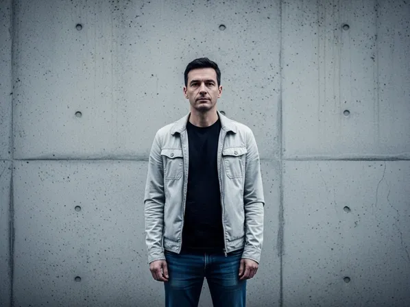
Use Case 1: Centered vs Rule of Thirds Portrait

What changed and why:
The centered version feels iconic, formal, almost poster-like. The rule-of-thirds version feels more dynamic and cinematic, with more context in the environment. In prompts, you can choose:
- “centered symmetrical composition” for iconic or graphic looks
- “rule of thirds portrait, subject on the right third” for cinematic realism
Use Case 2: Busy vs Clean Product Layout


What changed and why:
The clean composition reads instantly, like an advertisement or app hero image. Words like “minimal composition”, “negative space”, and “product on the left third” tell the AI to prioritize clarity.
Use Case 3: Flat vs Leading-Lines City Scene
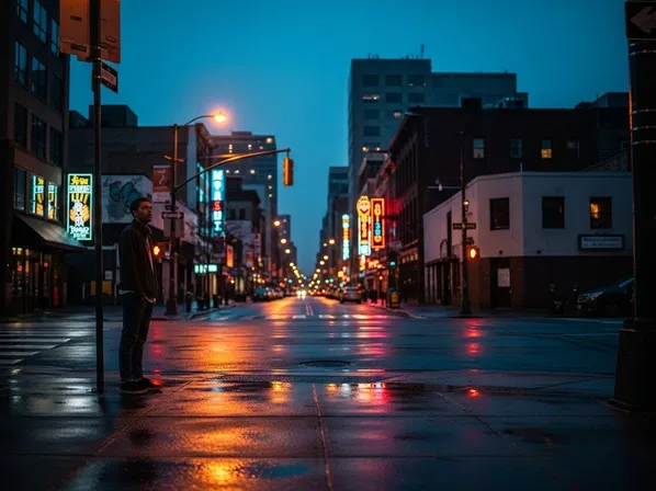
What changed and why:
Leading lines create a natural path for the eye and emphasize the subject. Prompts like “leading lines guiding the eye toward the hero” help the AI use streets, railings, or architecture as visual guides.
Use Case 4: Negative Space & Emotion
What changed and why:
The version with negative space feels more emotional, isolated, or contemplative. Phrases like “small figure in the frame, surrounded by large negative space” are powerful for storytelling.
3. What You Can Do Now (Practical Benefits)
By understanding composition rules, you can:
- Control where the viewer looks first, second, and third.
- Make your AI images feel intentional rather than accidental.
- Design poster-ready, thumbnail-ready, and ad-ready layouts directly in your prompts.
- Use negative space and balance to create mood, not just content.
- Keep a consistent visual layout style across series of images or characters.
From now on, instead of only describing “what” you want (a character, a product, a city), also describe where it sits in the frame and how the frame is organized.
4. Differences between Composition Rules and Camera Angle
Beginners often confuse composition with camera angle, because both influence how the scene looks.
Here is an easy way to separate them:
-
Composition Rules
- Decide how elements are arranged within the frame.
- Concerned with balance, placement, and visual flow.
- Keywords: “rule of thirds”, “centered symmetry”, “leading lines”, “negative space”, “framed by an archway”.
- Question it answers: “Where is everything placed inside the rectangle?”
-
Camera Angle
- Decides from where the camera is looking at the scene.
- Concerned with high vs low, front vs side, close vs far.
- Keywords: “low-angle shot”, “high-angle view”, “eye-level”, “top-down shot”, “over-the-shoulder”.
- Question it answers: “From what position and height are we viewing the scene?”
You can combine them:
-
Same composition, different angles
- Example: subject on the right third, but once from a low angle (heroic) and once from a high angle (vulnerable).
-
Same angle, different composition
- Example: eye-level view, but once with centered symmetry and once with rule-of-thirds placement.
In AI prompts, you often want both:
“Cinematic low-angle shot of a hero, subject on the right third, leading lines of the street guiding the eye toward them, deep perspective.”
Here, “low-angle shot” defines camera angle, and “subject on the right third, leading lines” defines composition.
5. Summary & Practice Exercises
Summary
- Composition rules control how elements are arranged inside the frame, guiding the viewer’s eye and shaping the story.
- The rule of thirds, leading lines, framing, symmetry, and negative space are practical tools you can explicitly mention in prompts.
- Off-center subjects (rule of thirds) feel dynamic and cinematic; centered symmetrical subjects feel iconic and graphic.
- Negative space simplifies the image and emphasizes mood, while leading lines and framing naturally draw attention to the subject.
- Composition is different from camera angle: composition is about placement in the frame, angle is about where the camera is located.
- Intentional composition language transforms random AI outputs into images that look planned, balanced, and ready for real-world use.
Practice Exercise: Basic Comparison
Use these exercises to build intuition for composition in AI images.
-
Centered vs Rule of Thirds Character
Generate two portraits:- “Portrait of a woman in a city street, centered symmetrical composition, face filling the frame, blurred background.”
- “Portrait of a woman in a city street, rule of thirds composition with the subject on the right third, street and lights visible on the left.”
Compare which one feels more like a poster vs a cinematic frame.
-
With and Without Negative Space
Generate:- “Product photo of a coffee cup, cup centered, background filled with café details.”
- “Product photo of a coffee cup, cup on the right third, large negative space on the left for text, minimal background.”
Decide which is easier to use as a thumbnail or ad.
-
Leading Lines Exercise
Generate two city scenes:- “Urban street scene at sunset, random composition, people and cars scattered.”
- “Urban street scene at sunset, leading lines of the road and buildings guiding the eye toward a single character at the end of the street, cinematic composition.”
Notice how much more focused the second version feels.
-
Emotion with Negative Space
Generate:- “A lone figure standing in a field, subject in the center, landscape filling the frame.”
- “A lone figure standing in a field, small figure on the lower right, huge empty sky taking up most of the frame, large negative space.”
Compare how the second version changes the emotional impact—more isolation, calm, or melancholy.
By repeatedly experimenting with composition-related keywords, you will start thinking like a visual designer as well as a prompt writer. Your AI images will not only look good individually, they will also read clearly, tell stronger stories, and fit better in real-world layouts like posters, covers, and UI screens.